
What’s in a car name – or a logo? Naturally, car manufacturers put a lot of thought into the icons that represent their brand. And while most are immediately recognizable, they are not always easily decipherable. Inspired by family crests to mythical gods to the night sky, all car logos and names have a story.
Acura
At first glance, Acura’s logo appears to be a stylized letter “A.” Some have suggested that it could also read as an “H,” which would make sense given that Acura’s parent company is Honda. But according to the manufacturer, the symbol is not a letter, but an image of a caliper. A caliper is an instrument used in science and engineering to precisely measure the thickness an object. This explanation makes more sense when you learn that the word “Acura” is derived from the Latin word “acu,” meaning “done with precision” or “mechanically precise.”
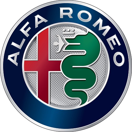
Alfa Romeo
Of all the car brand logos in existence today, Alfa Romeo’s may be the most unique, or at least the most ornate. The logo design combines symbols of Milan – the birthplace of the company – and the House of Visconti, the elite ruling family of Milan in the Middle Ages.
The Milanese cross dates to the time of the Crusades; Milanese soldiers wore the symbol in battle and included it as part of the city’s coat of arms. The biscione or “large snake” is an important figure in Milanese history, adopted by the Visconti family. The man emerging from the serpent’s mouth represents rebirth, and the crown is symbolic of Alfa Romeo’s world racing championship status.
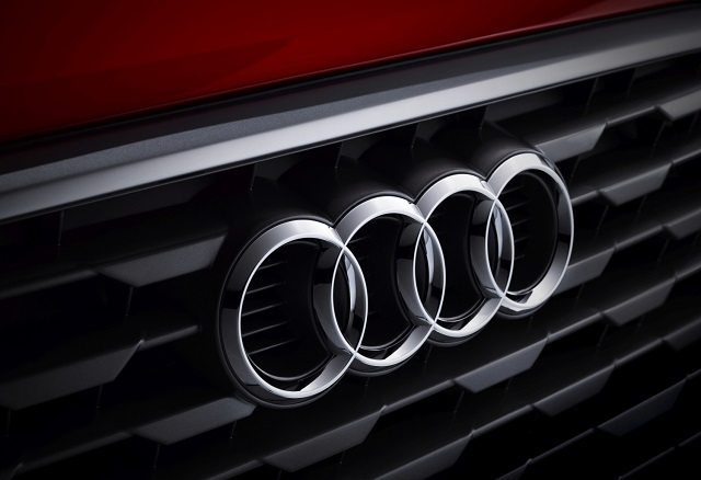
Audi
The meaning behind Audi’s four-ring emblem is straightforward enough: it symbolizes the four automobile manufacturers – Audi, DKW, Horch and Wanderer – that merged together to form the company.
How the name Audi came into existence was slightly more creative. Engineer August Horch began his car-building career by founding the Horch & Cie company in 1899. After encountering differences with the board, he left to form another car company. However, his surname was still a Horch & Cie trademark. While trying to choose a new company name, the son of one of Horch’s business partners suggested using the Latin translation of the engineer’s name. In German, “Horch” means “hark” or “hear.” In Latin, “Audi” means “to listen.”
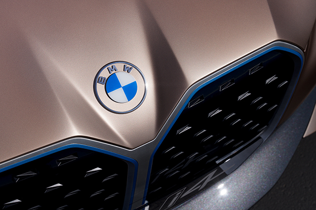
BMW
It has long been held that the BMW logo represented spinning propellers against a blue sky, a nod to the company’s history of making aircraft engines in the early 1900s. This is not the case, according to the company. The original logo was based on that of the Rapp Motorenwerke company, from which BMW was established. That logo was circular with “Rapp Motor” written around the edges. The German car manufacturer replaced the text with “BMW” and as an homage to its home state, painted the interior the Bavarian colors of blue and white.

Buying a New Car
Tips and tricks to get you through every step of buying a new car, whatever “new” means to you.
Download Now!So how did the propeller rumor start? It could have been a 1929 ad promoting a new aircraft engine BMW was building, which showed an airplane with the BMW logo in the rotating propeller.
While not technically its origin story, BMW has seemed to embrace the propeller idea over the years. On its website, Fred Jakobs of BMW Group Classic states that, “For a long time, BMW made little effort to correct the myth that the BMW badge is a propeller … This interpretation has been commonplace for 90 years, so in the meantime it has acquired a certain justification.”
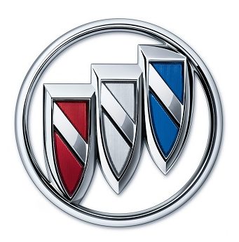
Buick
The tri-shield design of Buick’s car logo is based on the ancestral coat of arms of founder David Dunbar Buick’s family. “A designer researching the Buick family history at the Detroit Public Library in the 1930s found a description of the ancestral coat of arms in an approximately 80-year-old book of heraldry,” according to the marque. Buick’s familial roots were in Scotland and while the book didn’t have an illustration of the crest, it described a red shield with a contrasting, checkered line bisecting it from the upper-left to the lower-right corners.”
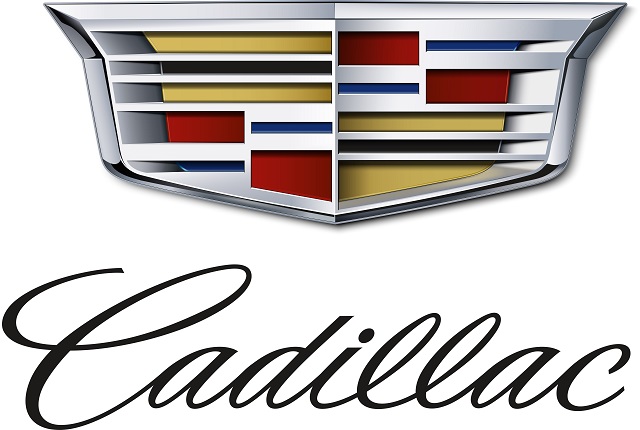
Cadillac
The Cadillac company was named after Antoine de La Mothe Cadillac, the man who founded Detroit. The manufacturer honored the French explorer not just in its name but also in its logo, which is roughly based on his family crest.
Though it has since evolved, for many years Cadillac famously featured what looked like ducks in its logo. The birds represented mythical creatures called merlettes, which were often used as a knight symbol and appeared in groups of three to represent the Holy Trinity.
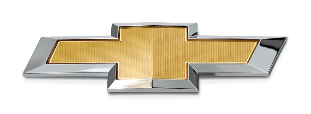
Chevrolet
The Chevy bow tie is ubiquitous on the roadways, but how the car brand logo came into existence is not so visible. There are at least four different versions of the emblem’s origins.
Chevy co-founder William C. Durant introduced the logo in 1913 and claimed that the symbol was inspired by a wallpaper design he saw in a Paris hotel room. Durant’s daughter Margery would later say that her father would doodle nameplate designs during dinner. Years later, Durant’s widow Catherine said in an interview that the logo was inspired by a design in a newspaper ad. The final theory is that the bow tie is a stylized version of the Swiss flag cross; Durant’s partner and company namesake Louis Chevrolet was born in Switzerland.
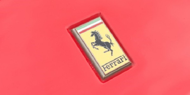
Ferrari
Founder Enzo Ferrari adorned his racing cars with the prancing black horse in honor of Italian Air Force ace pilot and national hero of World War I Francesco Baracca, who had the same design on his plane. Years after Baracca’s death, his parents asked Ferrari to use the image, suggesting it would bring him luck. Canary yellow, the city color of Ferrari’s hometown of Modena, Italy, was used as a background to complete the image.
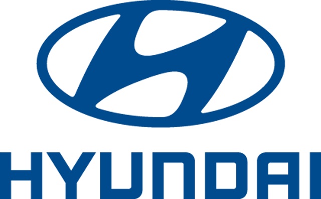
Hyundai
Yes, the Hyundai’s logo is a stylized “H.” However, the image is meant to depict two people, the company and the customer, shaking hands. The company states that this logo represents Hyundai’s promise to its customers.
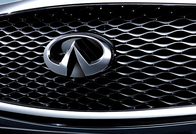
Infiniti
Nissan created the Infiniti marque to be a line of luxury vehicles. The logo the company designed depicts two central lines stretching into the horizon, symbolizing an endless road forward. Some have also suggested that the logo is a representation of Mount Fuji as a nod to Nissan’s Japanese roots, or that the logo is a play on a lemniscate, the mathematics symbol for infinity.
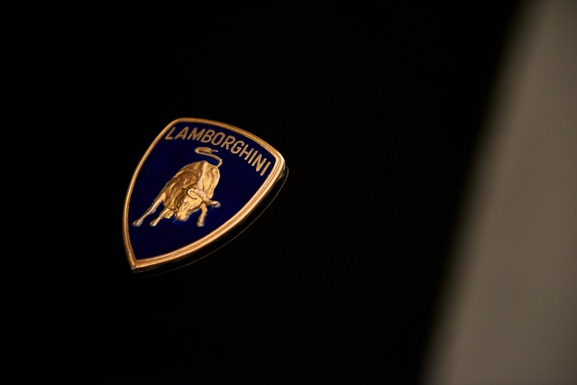
Lamborghini
Choosing the design of the Lamborghini logo was rather benign; founder Ferruccio Lamborghini had a passion for bullfighting and his astrological sign was Taurus, the bull. It’s the the story behind the colors that’s interesting. Legend has it that Lamborghini used the inverse color scheme of Ferrari’s logo in order to prod its competition. Lamborghini has a gold animal (a bull) with a black background. Ferrari has a black animal (a horse) with a gold background.
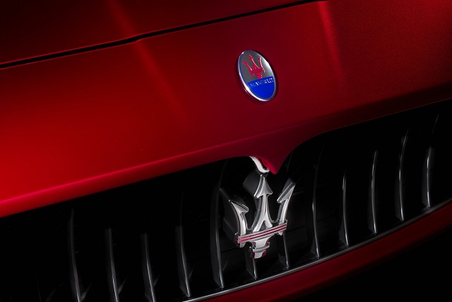
Maserati
The Maserati logo is unique in that it has existed since the creation of the company and has remained for nearly a century, virtually unchanged. Around 1920, the manufacturer needed a logo that it hoped would make their car stand apart. The family commissioned artist Mario Maserati, the sixth Maserati brother and the only one uninterested in engines.
Mario was inspired by the Fountain of Neptune in Piazza Maggiore in Bologna, where the Maserati brothers established their company. The statute depicts Neptune holding a trident, a symbol of strength and vigor. Thus, the trident logo was born. The red and blue colors of the Bologna banner adorn the image. Maserati states that, “The Trident underlines the exclusive status of the firm’s cars and their identity as masterpieces of elegance, luxury and sports-car performance.”
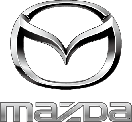
Mazda
Mazda has utilized several different logos since its inception in the 1930s. The current logo was released in 1998 with a slight update in 2015. The symbol depicts a pair of V-shaped wings inside an oval, collectively forming the letter “M.” According to the company, the wings represent Mazda’s determination to “pursue ongoing improvements to drive powerful, continuous growth.”
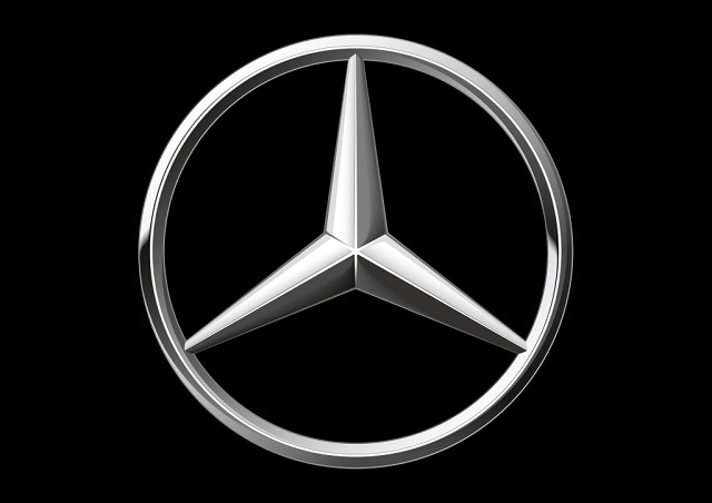
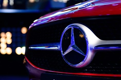
Mercedes-Benz
Before it became the Mercedes-Benz logo, the three-pointed star was first used on a postcard. Co-founder Gottlieb Daimler used the symbol to mark his family’s house on a postcard depicting a view of the town of Deutz during the time he was working as technical director of Gasmotorenfabrik Deutz. Following Daimler’s passing, his sons Paul and Adolf Daimler adapted a three-pointed star for use as the brand logo. Afterward, Mercedes-Benz has stated that the logo represents the company’s ambition of universal motorization on land, air and sea.
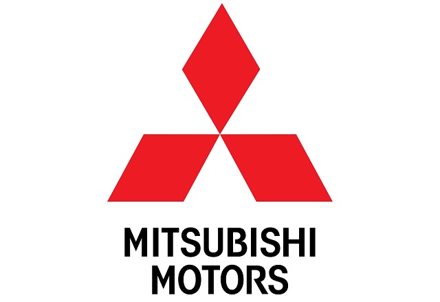
Mitsubishi
“Mitsubishi” is the combination of two Japanese words. “Mitsu” means three. “Hishi” means water chestnut, but the Japanese have long used the word to refer to a diamond shape, in lieu of the water chestnut’s diamond-shaped leaves. Mitsubishi founder Yataro Iwasaki chose the symbol as a reference to the three-leaf crest of his first employer, the Tosa Clan, and his family’s crest of three stacked rhombuses.
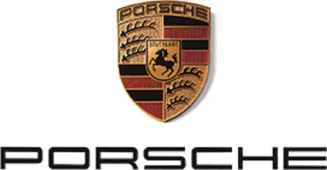
Porsche
The Porsche logo combines the coat of arms of the former German state of Württemberg and its capital city Stuttgart. The Porsche headquarters are located in Stuttgart. The horse on the logo was taken from Stuttgart’s coat of arms. The antlers and red and black stripes were adopted from the crest of the Kingdom of Württemberg.
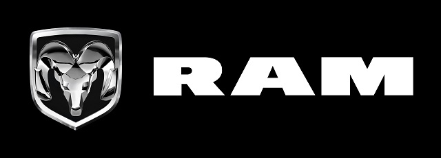
Ram
The Ram’s head logo that is now synonymous with the Ram trucks debuted in the 1930s as a hood ornament on all Dodge cars. Sculptor Avard T. Fairbanks designed the ornament as a symbol of vehicles that were swift, strong, sure, and proud.
After working out several different designs in clay, including a lion, tiger and jaguar, Fairbanks presented a leaping ram to owner Walter P. Chrysler and several other executives, according to Ram. Fairbanks chose the ram because, “It’s sure footed; it’s the king of the trail; and it won’t be challenged by anything.” Eventually, the Ram name was given to the marque’s line of trucks.
Subaru
The Subaru logo is a reference to the most visible stars in Pleiades, a cluster of stars in the constellation of Taurus. Subaru is the Japanese name for the Pleiades cluster. Why name a car brand after a group of heavenly bodies? The logo has another significant meaning. The merger of five smaller companies created Subaru’s parent company FujiHeavy Industries. In the logo, the large star represents FHI and the five smaller stars symbolize the merged companies.

Tesla
It’s not just a cool-looking “T.” It’s a cool-looking “T” that also represents a cross section of an electric motor.
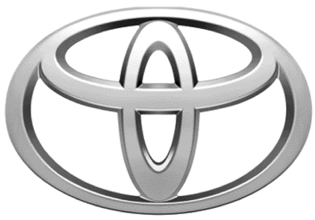
Toyota
The Toyota logo consists of three overlapping ellipses, two of which spell out the letter “T.” According to the manufacturer, the ellipses “symbolize the unification of the hearts of our customers and the heart of Toyota products.”
Volvo
Volvo began as a manufacturer of ball bearings, which helps explain its name. “Volvere” means “to roll” in Latin, thus “volvo” translates to “I roll.” When Volvo began producing cars, it utilized the ancient symbol for iron, a circle with an arrow pointing diagonally upwards to the right, as its logo. (This symbol was originally used to represent Mars, the Roman god of warfare. An early connection was made between the Mars symbol and the material from which most weapons of war were made of – iron.) For Volvo, their adapted logo symbolizes steel and strength with properties such as safety, quality and durability.
What is your favorite car brand logo backstory? Is there any that we missed? Let us know in the comments below!
Love stories like this? Visit our Auto History page for more.

Related Articles


Trending Articles


NEWEST ARTICLES


12 Thoughts on “The Stories Behind Popular Car Logos and Names”
Leave A Comment
Comments are subject to moderation and may or may not be published at the editor’s discretion. Only comments that are relevant to the article and add value to the Your AAA community will be considered. Comments may be edited for clarity and length.

Don’t call Volvo’s “Iron Mark” the man symbol, it bothers them.
When first saw the 3 elipses for Toyota I asked an employee. He said it represented the worlds of business or something like what the Dodge Brothers 6 pointed star stood for.
No suprise with Acura, when the brand was introduced the TV advertising showed drawing instruments on top of a technical drawing and the dividers rose up and became the “A” in Acura.
What about Lexus, a great car!
How about Ford and Lincoln?
What about Lincoln / Mercury /Ford/ Pontiac /Oldsmobile ???
studebaker – but how about an article on hood ornaments- love some of them on the old cars!
Hi Patricia, we got you covered! Check out our story on hood ornaments. 🙂
What about Opel and Morris.
Mercury, Jaguar, Chrysler
What about Nissan?
What about Honda?